VARSITY
Date
2025.09.08
Category
WEB, DESIGN
Type
PROJECT
Credits
Executive:SS
Project Lead: SS
Lead Developer: ZC
Designer: LL
UI/UX: AA
Description
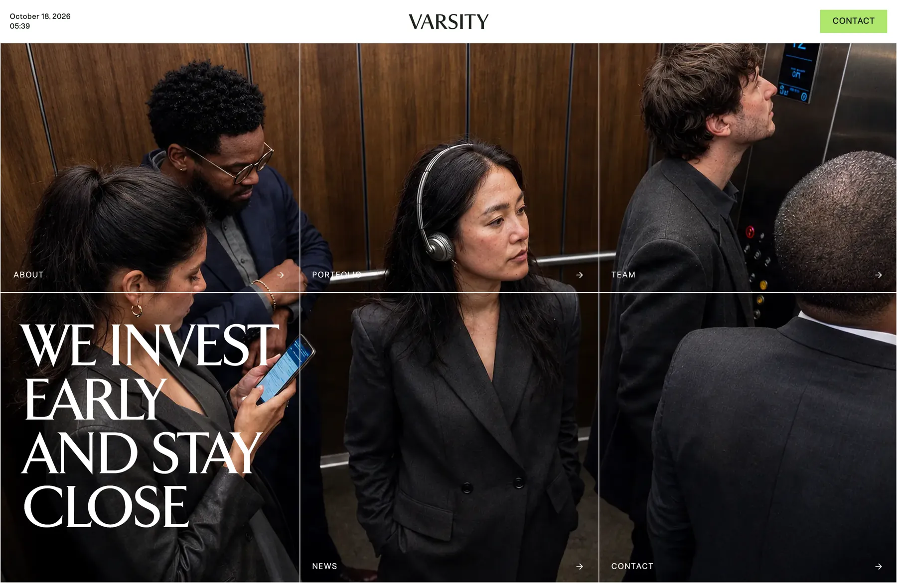
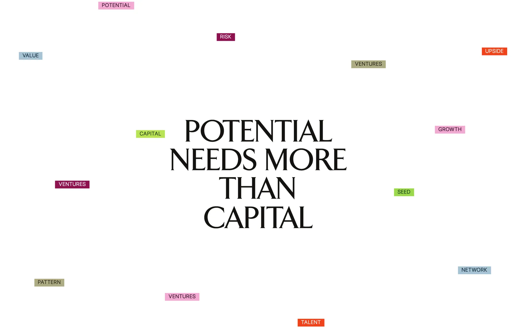
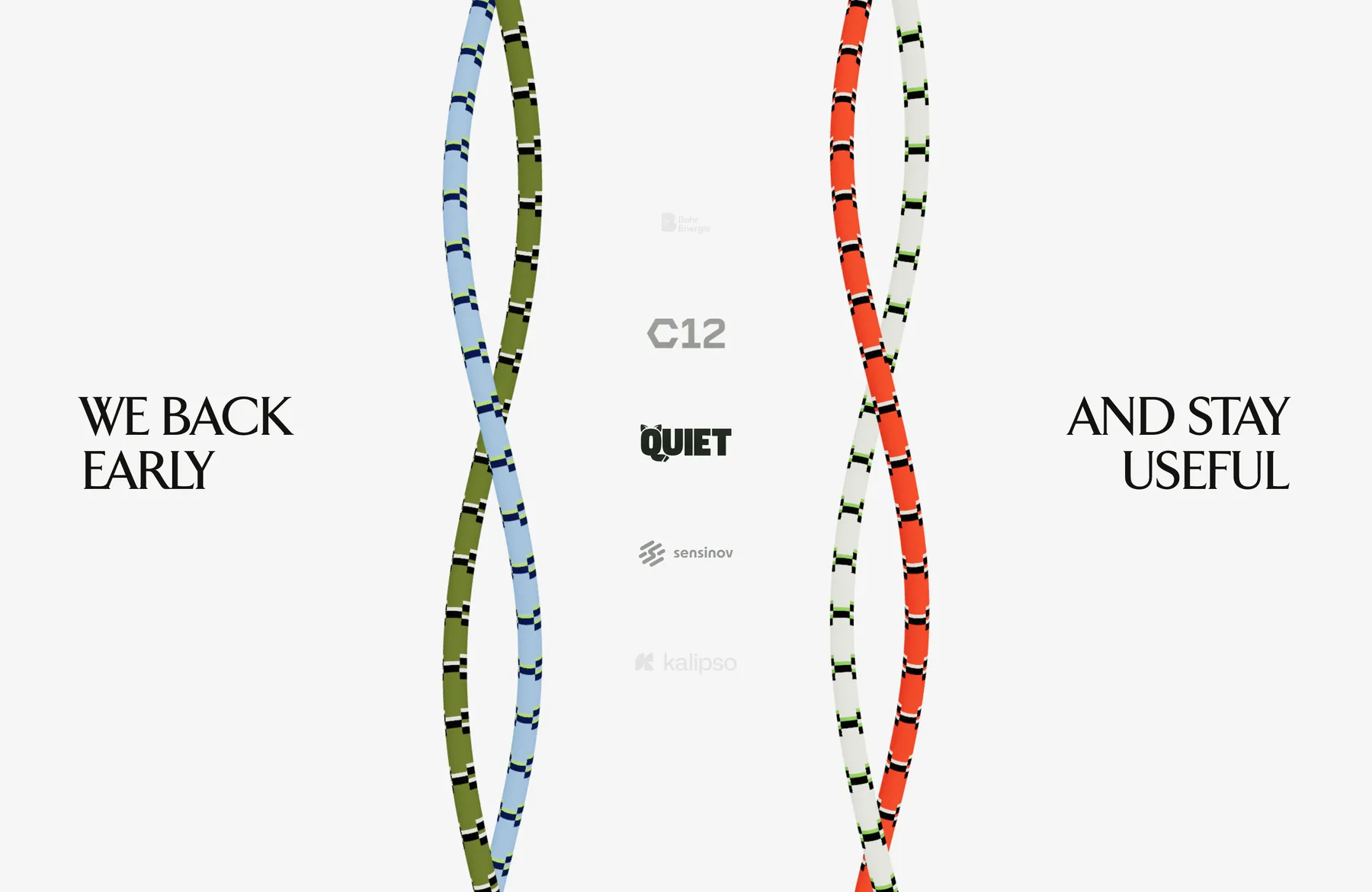
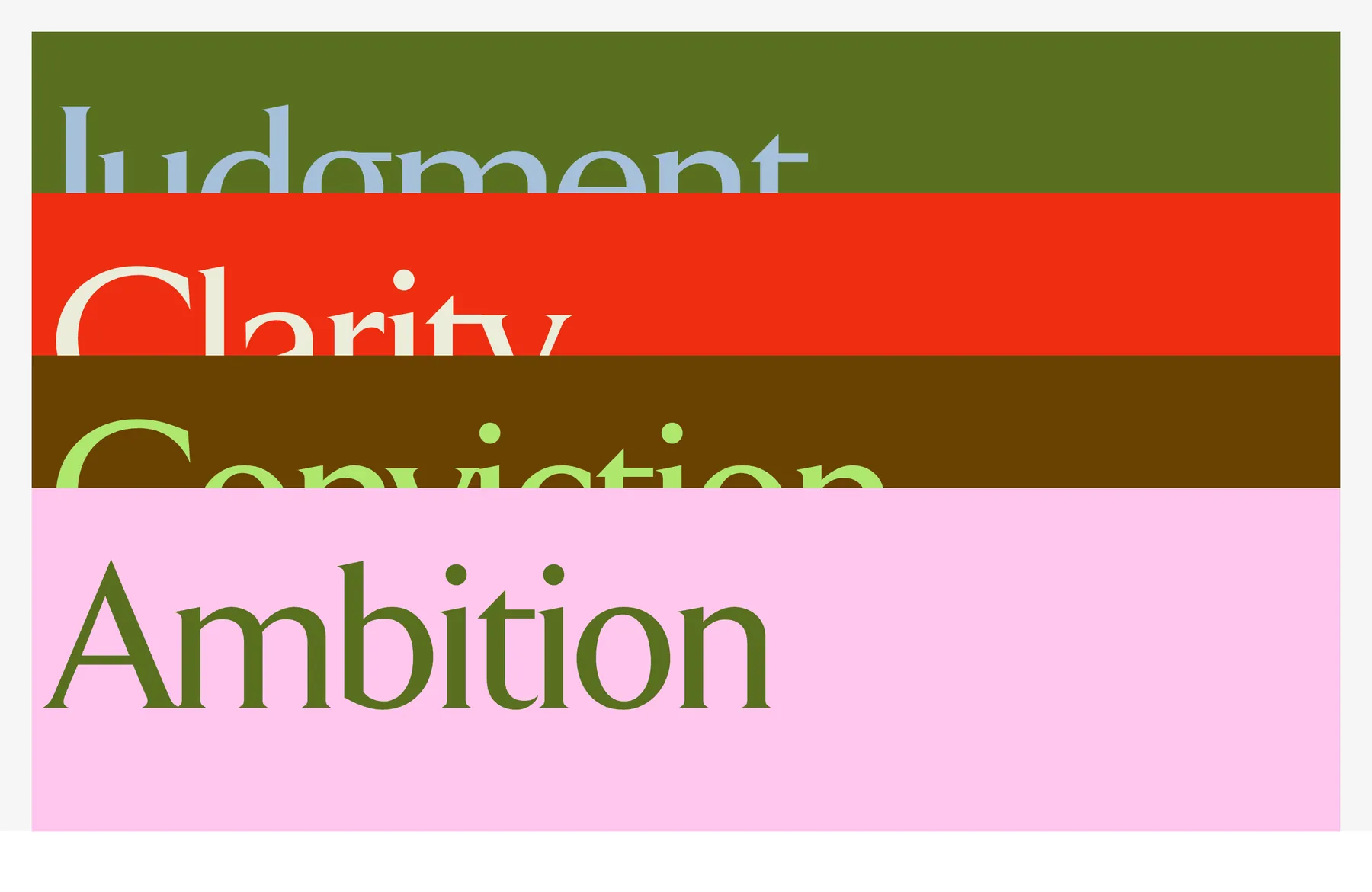
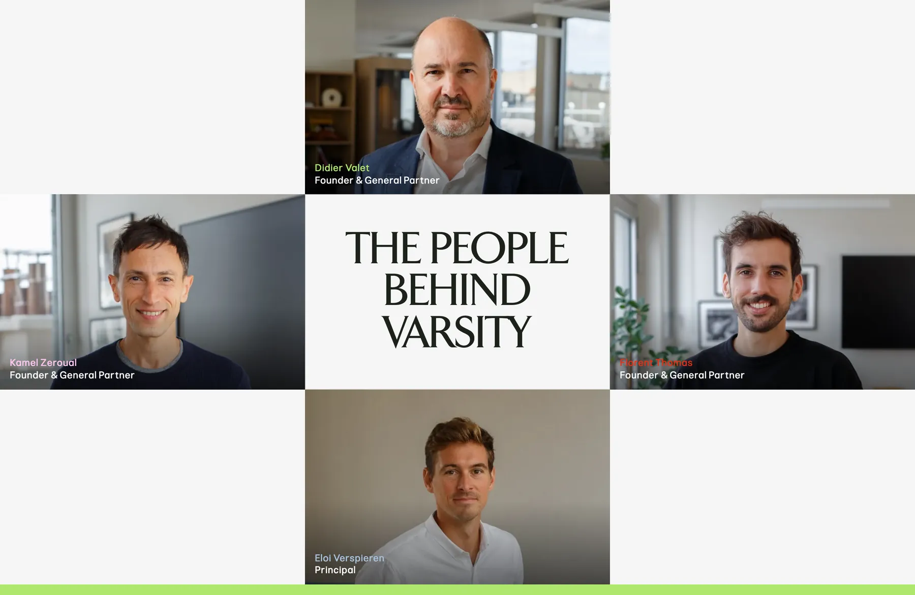
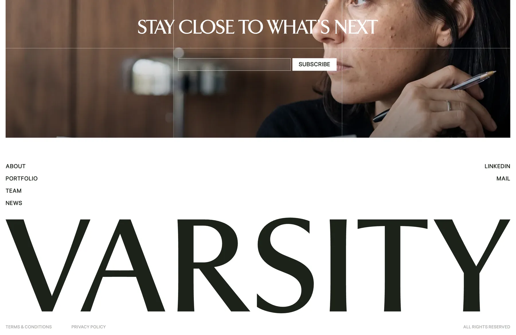
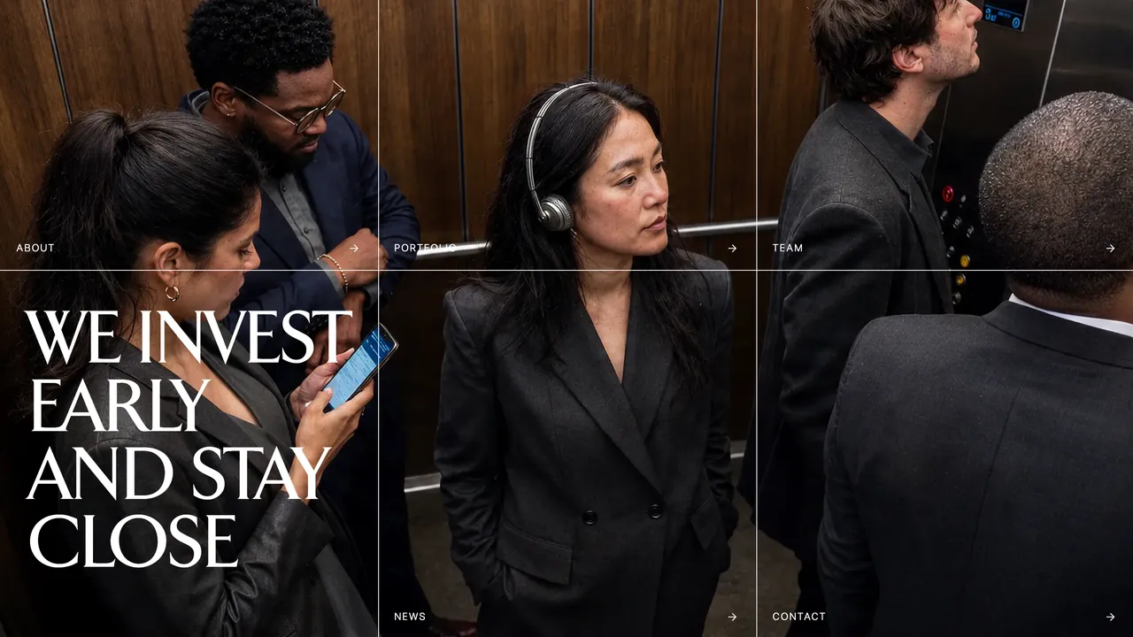
Varsity is a European seed-stage fund that backs founders early and stays close long after the cheque, and we built the site around that sense of proximity. It opens inside a crowded lift split into tiles that double as the menu, then lets words like risk, talent and upside drift around a single line on potential while portfolio logos rise between two braided ribbons. Four values stack like cards in olive, red, rust and pink, tall serif capitals give each statement its weight, and the page closes on the name itself, set edge to edge.